The Psychology Behind Great Websites and Logos

The Psychology Behind Great Websites and Logos
Having websites and a logos are a given when you have a business.
Say, your company’s name is Precious Properties. Almost always, curious and potential clients will search for your presence online to learn more about your business. Although they may not have noticed it, clients will have some initial barricades set up to know if your information is worthy to be accepted. This is thru phonetics and aesthetics.
So upon typing Precious Properties on search engines, customers will click whichever link yields the most ear- and eye-catching keywords (hopefully it’s your website and not some doppelgänger or negative review links out there). Your customers will then feast on whatever is presented to them in words, layout and images. And since our human interest tends to lean towards pictures over text, customers will unknowingly look for your logo first before exploring the entire content of your website.
Needless to say, they have landed to your site and got engaged with your business because they like what they saw and heard online.
But why do our customers only look at and listen to pretty stuff? To answer this, I think we need to explore the deeper, psychological aspect of human interest:
- Great Design Enforces Positive Association- Seeing beautiful things stirs up happy, calm and trusting feelings. A clean, professional-looking website and logo will lighten up people’s mood allowing you then to enter their deeper subconsciousness and confidence to explore possible ventures with you.
- Great Design Means Less Stress- Zen is the keyword here. A balanced and harmonious layout will clear your customers’ thoughts from clutter. If your website and logo are messy, your customers will get the vibe and they will likewise feel the frustration to clean it up or leave it alone. The more frustrated your customers become, the shorter time they will spend knowing you and the fewer people will want to get in touch with you.
- Great Design Means Competence and Professionalism- Good-looking collaterals are a manifestation of how meticulous, passionate, competitive and professional you are in dealing with others. On the other, a sloppy design would imply that you lack the x-factor in doing business with anybody. Pay close attention to how you present your websites and logos as this shouts how you do business with your clients.
Point is, customers will only absorb information if their senses such as sight and sound are satisfied in the first place. Hence, good-looking websites and logos for your business should be in place to become one step closer to having a sale.
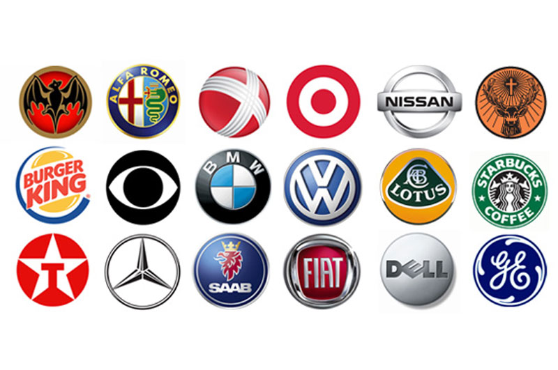
Image credits: http://logodesignerblog.com/wp-content/uploads/2009/03/circle-logo-designs-small.jpg