5 Great Ways to Improve You Real Estate Website

5 Great Ways to Improve You Real Estate Website
Congratulations on putting up your real estate website! Great Job! But don’t stop here. This is just the first step in making your online presence strongly felt. I want you to exceed your visitors’ expectation and make them say, “Wow! This company is something! I better contact him NOW!” by just browsing your site for a few minutes. So without any delay, below are some tips I have gathered to make your website P-R-E-T-T-Y from aesthetics down to content. Let’s get started.
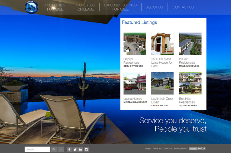
- Easy on the Eyes Website. Aside from having great quality pictures to feature your property listings, the overall layout of your website should be clean, smooth and professional. Avoid incorporating unnecessary ads or music in your page and make your visitors focus on your core business. Your tabs and its contents must also have a logical flow. For instance, the Contact Us tab is usually placed right after you have featured your property listings. Doing otherwise would make you look like a scam. Lastly, be consist in the usage of your brand’s logo, fonts and colors. The more conscious you are in terms of following standard aesthetics with your corporate collateral, the more credible you look even. The more credible you look, the higher the chances of you setting an appointment.
- At home with your Home Page. Your visitors should be able to search for a comprehensive property listing with ease and style in this tab. Include pictures as well as all important details related to the properties you are offering. If you can, offer an advanced type of search filter such as based on location or type of property or budget for more customer assistance.
- Honesty About Us. As our business includes huge amount of money, you need to get people’s trust first. Show your clients and visitors that you very well know how hard it is to earn a huge amount of money to buy a property and you are there to make honest business. Display your integrity and authority by including your license, associations you are affiliated with and industry achievements you have garnered. You can also link up real estate developers that have entrusted to you their listings for more pull.
- Your Call To Action and Contact Us tabs are screaming for attention. Rather than embedding a link in your text, include a line like “Click here for more”. This is effective as this approach taps our nature to just know some stuff that others may not know right that very moment. Your “Contact Us” should also remind your visitors where and how they can get in touch with you. Once they are in this tab, interact with them ASAP. Place an inquiry box to encourage them to ask for questions, quotations and appointments on the spot or better yet put up an online helpdesk (that is really online) to provide chat assistance as they browse thru your website. That would be really cool!
- Content is King. Make your content updated and useful from property listings to blogs. But for now, let’s focus on the latter as property listing updates are common sense. Share your expertise and insights on real estate issues. You can focus on your local location to have a deeper connection with your real clients then pair this with photos and videos to make it more enjoyable to read.
Remember, having a real estate website doesn’t mean simply creating one. Your main goal is still to make business 24/7, 7 days a week, even when you are off the grid. Hence, you have to have a constant commitment to ensure that your site actually functions to entice people to click, browse, stay and transact business with you.
Image credits: http://www.provest.ph/